Motivating employees to learn and upskill is rarely the issue, especially since workers compete not just with each other but also with automation and AI. Given that you provide relevant, quality content, the real challenge is time, as employees, on average, have only 24 minutes per week to learn.
In this case, L&D's role lies in finding sustainable approaches that learners can integrate into their established routines without drastic changes and sacrifices. One such strategy is mobile learning.
Over 80% of the global population owns a smartphone. The average person spends 4 hours and 37 minutes on their phone each day.
That's over one day per week, which leaves plenty of opportunity to fit in and even expand those 20-30 minutes of learning. Leveraging mobile technology to deliver learning means meeting learners where they are.
However, smartphones are a very distinct medium, with their unique capabilities and limitations. Developing mobile-friendly learning is not just about resizing content to fit a smaller screen. We've got to think about how people use their phones to make learning convenient, impactful, and accessible right where they need it most.
Adapting learning content for mobile user scenarios
Mobile phones' portability means that while we can learn anywhere on the go, we'll most often be in environments that are not very conducive to learning: during the commute, on the sales floor, during breaks, lunch, or in between work tasks.
Imagine your learner on a crowded subway train, one hand on the handrail, trying to keep their balance and not step on someone's foot. The noise cuts through the headphones, and the internet keeps going down between stations.
They have 20 minutes to themselves and hope a quick learning session will help them tune out of the joys of public transportation and into a productive mindset. They pull out their phone with a free hand and tap your training app icon. Whether they will finish even one lesson depends on how well you adhere to these general content development principles:
Microlearning is the name of the game
The shorter and more focused the session, the easier it is to keep attention and retain information. Design lessons to be completed in 5-10 minutes to fit the short bursts of time users have during their day. Aim for one topic per lesson and one idea per screen.
Adjusting UI for different environments
Ensure the interface contrast works in different lighting conditions, from bright sunlight outdoors to dimly lit areas.
Allow users to control audio settings and provide subtitles to ensure they can still learn even in noisy environments or when they don't have headphones and can't use the speakers.
Easy pause and resume
Lessons should be easily paused and resumed so learners can pick up right where they left off without frustration. It's also helpful to add progress indicators so users can make an educated guess on how long it will take to complete the module and manage their time effectively.
Addressing smartphones' technical limitations
Even though modern phones are much more potent than ten years ago, they are still pocket devices with apparent constraints:
- Smaller, vertical screens and touch input make it more difficult to interact with certain types of content.
- Devices can struggle with demanding content like long HD videos or complex simulations because of hardware limitations like battery life, storage space, processing speed, and internet with unstable connection, slow speeds, data caps, and limited bandwidth.
- Different phone models perform differently, so there's no one-size-fits-all approach.
The learning design should compensate for all of those.
Optimizing UX and content for touch input
Design buttons, links, and interactive elements to be easily tappable. Don't make users type essays with one thumb; choose touchscreen-friendly tasks.
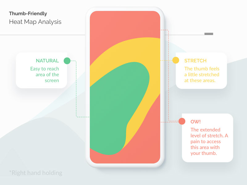
Consider the common screen-tapping areas based on how users hold their phones to place important buttons and interactive elements within comfortable reach (most people use phones with one hand).
Uncluttering the design
Keep the design clear and minimalist — empty space is your friend. Hide navigation in a dropdown menu and make learning content the focus of the learner's attention. Cut down on all unnecessary texts and multimedia, ensure users don't have to scroll endlessly and ensure the details in images are visible even at lower resolutions. Use square or portrait images unless the module requires the user to always hold the phone horizontally.
Keeping content lightweight, fast-loading, and accessible
Redoing something for the fifth time because the app/website lost all your previous input during a brief internet downtime is infuriating. To ensure offline access, download files in the background and cache the user's session. Use multimedia that won't strain smartphone resources, especially for downloads.
Ideally, images should be under 1 MB in JPEG for photos and PNG for graphics. Short video clips are best kept under 10 MB in MP4. Audio files should be under 5 MB, using formats like MP3 or AAC.
Also, be mindful of latency in user-module interactions, such as minigames and quizzes. Smooth, quick responses are essential for maintaining user engagement.
Testing the design responsiveness
Choose authoring tools that support responsive design and test your content on various phone brands, models, and operating systems. Use virtual machines to check layouts and real devices to identify possible technical issues. Ensure users can easily report problems and share feedback.
Leveraging smartphones' capabilities
Smartphones also offer a range of unique capabilities that can substantially enrich your instructional design repertoire with learning experiences that are dynamic, context-aware, and deeply integrated into the learner's daily life in a way that wouldn't be possible on a PC.
Touchscreens, built-in sensors such as accelerometers and gyroscopes, cameras and microphones, push notifications, and accessibility tools open up numerous possibilities for immersive, personalized, and accessible training.
Interactive and gamified content
Use the touchscreen for interactive content, such as dragging elements, drawing tasks, or tapping to select answers. Incorporate assignments that require users to submit photos, audio recordings, or videos.
You can also add a whole other layer of interactivity by using the phone's gyroscope and accelerometer for sensor-based manipulation, e.g., enabling users to tilt or rotate their phones to interact with 3D models or navigate virtual environments.
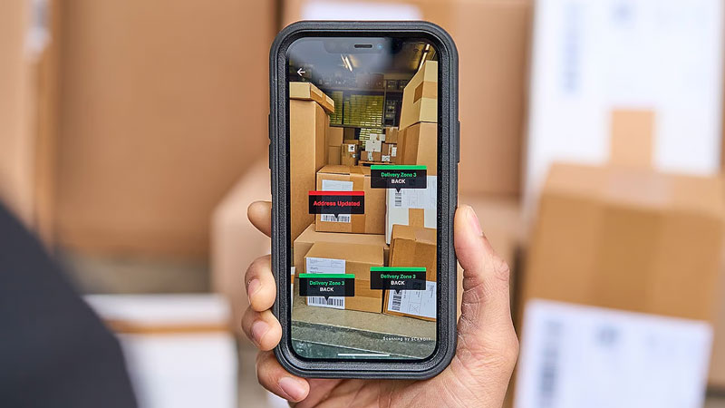
Augmented reality and 3D visualizations
AR can provide immersive learning experiences that are not possible with traditional methods. Use the smartphone camera to overlay digital information on the real world, e.g., to visualize how a product fits into a physical space or explore interactive 3D models.
Contextual content adaptation
Adapt content automatically based on the time of day. For instance, you can schedule push notifications for times when the user is most likely to be free. Use geo-location data to tailor content to the user's current location. For example, retail employees can receive training relevant to their specific store layout or regional promotions.
Integrating accessibility features
Incorporate speech-to-text functionality for users who prefer dictating their responses instead of typing. This can be particularly useful for filling out forms or taking notes. Ensure that content is compatible with screen readers, allowing visually impaired users to access the material through audio descriptions. Leverage voice assistants like Siri or Google Assistant to navigate through learning modules or provide quick access to specific information.
Get started with mobile learning today!
Providing learners with mobile-friendly learning options empowers them to seize every opportunity to learn and grow. This is a must-have for any organization that strives to make employee learning and development an ongoing habit instead of an on-and-off chore, regardless of your field of work or whether your employees are desk-bound or on-the-go.
However, creating mobile-friendly content is a nuanced process that requires expertise in instructional design, user experience, and mobile technology. An experienced development team can ensure your content is optimized for mobile devices and delivers an exceptional learning experience.
Contact us if you need expert assistance creating content for your LMS or developing a comprehensive mobile e-learning app. Let us help you meet your learners where they are and make L&D an integral part of their daily routine.
Published on July 9, 2024